Color Psychology: Small Changes, Big Conversions
Why Color Matters in Email Marketing
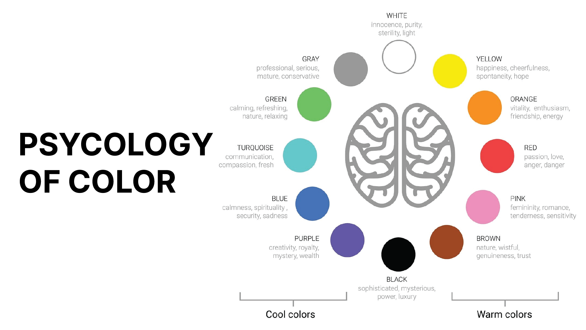
Color isn’t just decoration. It’s a tool that affects how customers feel and act once they open your email. In a recent study, researchers Sarah L. Thompson and Michael J. Green showed how color psychology impacts email engagement. Different colors evoke different emotions, and these emotions drive actions. Click-through rates and even conversions can rise or fall based on color choices.
For ecommerce brands, this can be a game-changer. But if your brand has strict guidelines, using color psychology may seem tricky. Can you use color psychology and still stay true to your brand? Yes, you can. Here’s how.
How to Use Color Psychology While Staying True to Your Brand
If your brand is set on certain colors, you can still leverage the power of color psychology. Here’s how to do it subtly and effectively.
1. Add Subtle Accents Without Changing Your Core Colors
Sometimes, small accents are all you need. You don’t have to overhaul your design to make color psychology work. Try adding subtle hints of color in strategic places to drive urgency or excitement.
- Example: If your brand colors are neutral, add a small red icon for a flash sale or highlight the words “limited time” in yellow. These small tweaks grab attention without overpowering your brand’s core look.
2. Use Shade Variations Within Your Brand’s Palette
If you have flexibility in your palette, explore darker or lighter shades to create the right effect. The study showed that shades within core colors can still influence emotion.
- Blue: Use a darker blue in order confirmations or account updates. Blue builds trust and makes customers feel secure.
- Green: Use a lighter or brighter green in loyalty or referral emails. Green feels fresh and encourages customers to take action without pressure.
- Why It Works: Sticking to your palette keeps your emails cohesive, but shifting shades can create subtle, emotional effects that enhance engagement.
3. Take Advantage of Seasonal Campaigns
Many brands allow more flexibility during seasonal campaigns, so use these times to experiment. Customers expect seasonal colors, which makes it a great time to introduce a color accent based on the psychology insights.
- Example: Use red for Black Friday sales to show urgency or try yellow during holiday promotions for warmth and positivity. These colors align with holiday expectations, and you’re free to return to your standard colors afterward.
- Why It Works: Seasonal allowances let you explore color psychology in controlled ways. It’s a win-win—you keep the brand intact while creating emails that feel fresh and relevant.
4. Use Typography to Convey Emotion
If color options are limited, typography is your next best tool. Certain fonts, italics, or bolding can create the same urgency or excitement as color without altering the design.
- Example: Use italic or bold text in phrases like “limited time” or “only today” in your brand’s red or green. This makes the message feel more immediate.
- Why It Works: Typography highlights urgency and draws the reader’s eye to key phrases, enhancing the effect of your message without any new colors.
5. Segment Your Audience for More Personalized Color Variations
Consider using color variations within your segments. High-value customers, for instance, respond well to luxurious, deeper colors, while deal-focused customers respond to vibrant, exciting shades.
- Example: Use a darker, richer version of your brand colors for VIP emails. For discount-oriented customers, add a brighter shade in promotional messages.
- Why It Works: When you tailor colors to each segment’s mindset, you’re aligning with what motivates them. Small color shifts can make each segment feel more connected to the message.
Conclusion
Color is a tool that, when used right, makes your emails stronger. Brand guidelines don’t have to limit your creativity or effectiveness. By adding subtle accents, exploring shades, using seasonal flexibility, adjusting typography, and segmenting customers, you keep your brand’s visual integrity while boosting customer engagement.
Try one or two of these techniques in your next email campaign. Track what works. Even small changes in color or style can make a big difference. Color psychology doesn’t need to be bold to be effective—sometimes, it’s the quiet, thoughtful touches that have the most impact. With these tools, your emails can be both brand-true and customer-focused, creating a lasting impression with every message.