Designing Emails That Sell: Actionable Principles for Impactful Email Design
Email design is more than just aesthetics—it’s strategy in action. A well-designed email captures attention, builds trust, and drives conversions. This blog provides actionable design principles backed by studies to help you create emails that not only look good but also deliver results.
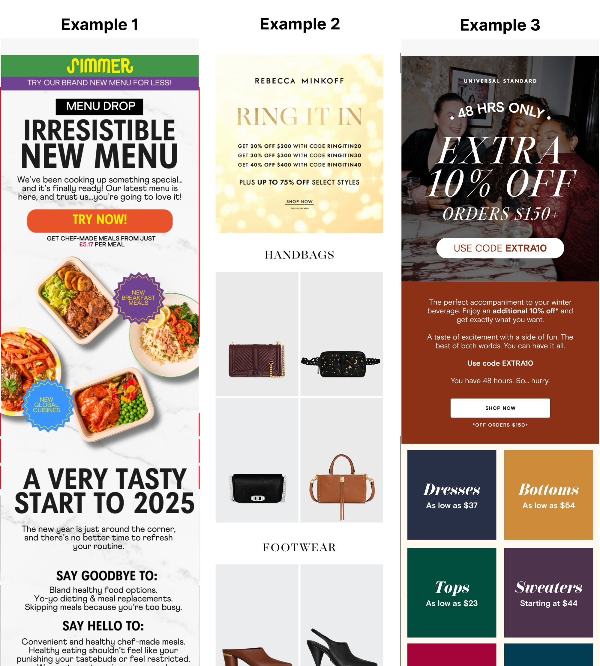
1. Visual Hierarchy: Guide Attention Naturally
Why It Matters
Readers skim emails rather than reading them word for word. Your design must guide their eyes to what matters most—headlines, supporting details, and the CTA (Call to Action).
Actionable Tips
- Use larger fonts for headlines to grab attention.
- Highlight key elements, such as CTAs, with contrasting colors or bold typography.
- Apply the Reverse Pyramid Structure:
- Start with a bold, attention-grabbing headline.
- Add concise supporting details.
- End with a clear, actionable CTA.

Study Insight: Eye-tracking research shows that elements with high visual prominence naturally attract more attention.
2. White Space: Let Content Breathe
Why It Matters
A clutter-free design increases readability and naturally directs the user’s focus to key content. Overloading the email with too many elements can overwhelm readers.
Actionable Tips
- Add generous margins and padding between sections to separate content visually.
- Limit the number of elements on-screen to highlight key information.
- Use white space to create a clean, minimalistic layout that directs attention to CTAs.
Study Insight: According to Nielsen Norman Group, white space improves comprehension by up to 20%.
3. Top of the Fold: Maximize Prime Real Estate
Why It Matters
The first visible section of your email determines whether a reader continues or exits. This area must captivate and convince them to scroll further.
Actionable Tips
- Place your headline and primary CTA above the fold.
- Use a visually striking hero image or banner to grab attention immediately.
- Include concise, value-driven text to communicate the purpose of your email quickly.
4. Mobile-First Design: Prioritize Small Screens
Why It Matters
With over 61% of emails opened on mobile devices, designing for smaller screens is essential. A seamless mobile experience improves engagement and reduces friction.
Actionable Tips
- Use single-column layouts for easier scrolling.
- Ensure buttons are thumb-friendly, with a minimum height of 48px.
- Test email designs on multiple devices and screen sizes for consistency.
Study Insight: Litmus research shows mobile-friendly emails achieve 15% higher click-through rates.
5. Font & Spacing: Enhance Readability
Why It Matters
Unreadable text leads to frustration and email abandonment. Proper font size, line height, and spacing make your email accessible and engaging.
Actionable Tips
- Use a font size of at least 16px for body text.
- Maintain a line height of 1.5x the font size for easy readability.
- Add extra spacing between text blocks and sections to improve visual flow.
Study Insight: Web Content Accessibility Guidelines recommend these typography standards for improved clarity.
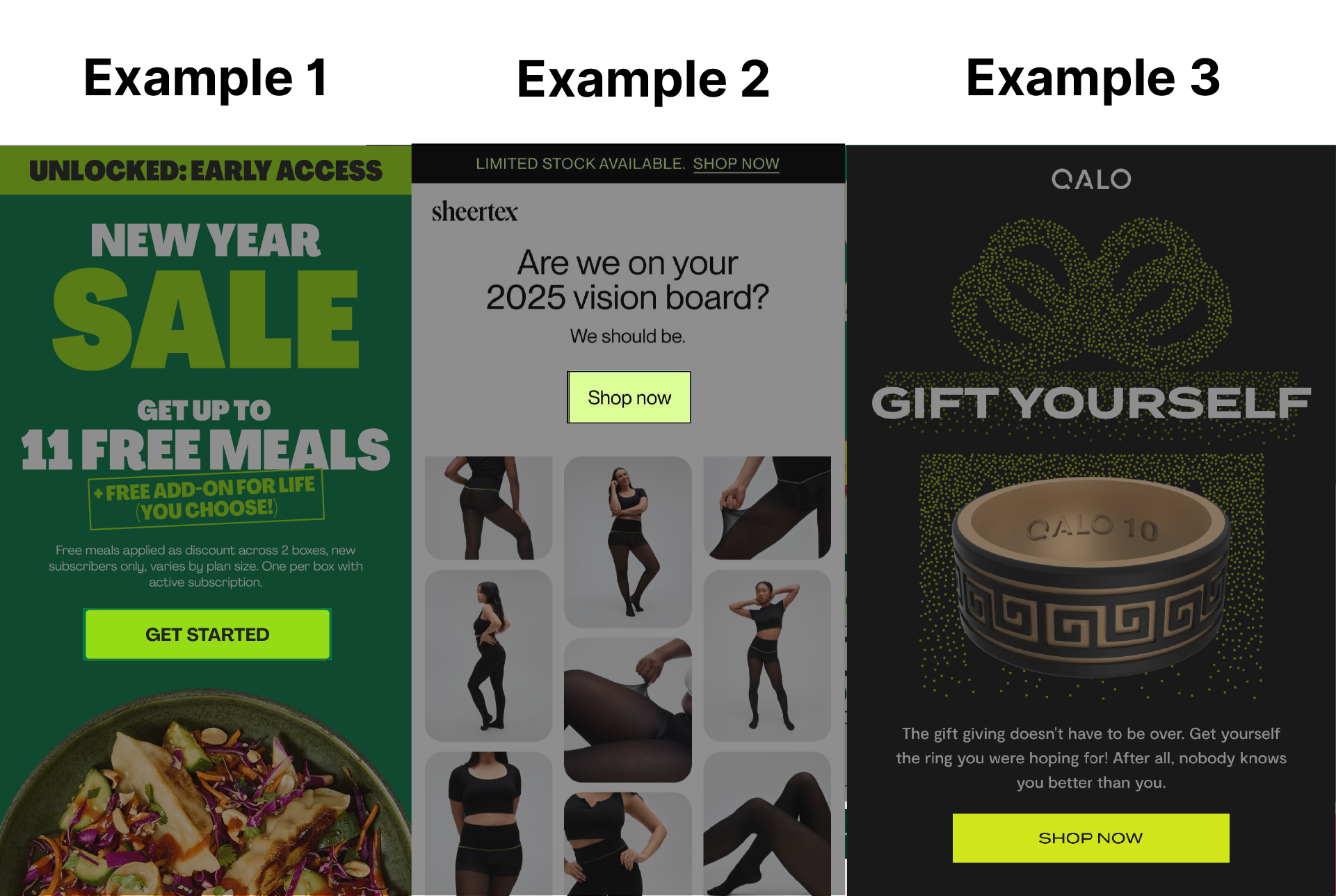
6. CTA Design: Drive Clear Actions
Why It Matters
Your CTA is the centerpiece of your email, prompting readers to take the desired action. A well-designed CTA boosts click-through rates significantly.
Actionable Tips
- Make CTAs stand out with contrasting colors and bold text.
- Use clear, action-driven language (e.g., “Get My Discount”).
- Include multiple CTAs in longer emails to ensure one is always within reach.
Study Insight: Studies show button-like CTAs increase click rates by 45% compared to plain text links.
7. Dark Mode Compatibility: Adapt to User Preferences
Why It Matters
Dark mode adoption is growing rapidly, and poorly optimized emails can appear broken or illegible.
Actionable Tips
- Test designs for both light and dark modes to ensure compatibility.
- Avoid transparent PNGs that might display poorly in dark themes.
- Use contrasting text colors that remain readable in dark environments.
Study Insight: Campaign Monitor reports that 81.9% of email users prefer dark mode for its visual comfort.
8. Accessibility in Email Design
Why It Matters
Inclusive design ensures that your emails are effective for all users, including those with disabilities. Accessibility isn’t just good practice; it’s a necessity.
Actionable Tips
- Provide descriptive alt text for all images.
- Maintain high contrast between text and background for readability.
- Code emails to support screen readers and test for accessibility compliance.
Study Insight: Emails that meet accessibility standards improve engagement across diverse user groups and avoid legal pitfalls.
Conclusion
A great email isn’t just about looking good; it’s about delivering an experience. By applying these actionable principles—visual hierarchy, white space, mobile-first design, and accessibility—you can create emails that captivate and convert