The Science of Visual Hierarchy in Email Marketing
Emails are about connection. But that connection only happens if your readers actually engage. In a 2024 study, Jessica A. Martin and Thomas L. Harris showed that visual hierarchy plays a big role in how people interact with emails. A clear structure guides readers through content, helping them see what’s important. It boosts click-through rates and even conversions. For ecommerce brands, using visual hierarchy is more than just good design—it’s about results.
Visual hierarchy means organizing content so readers know where to look first, next, and last. It’s about leading them to the right spot, making sure your message gets across. Here’s how you can use it to make every email more effective.
How to Use Visual Hierarchy to Improve Engagement
These steps will help you create a strong visual flow in every email.
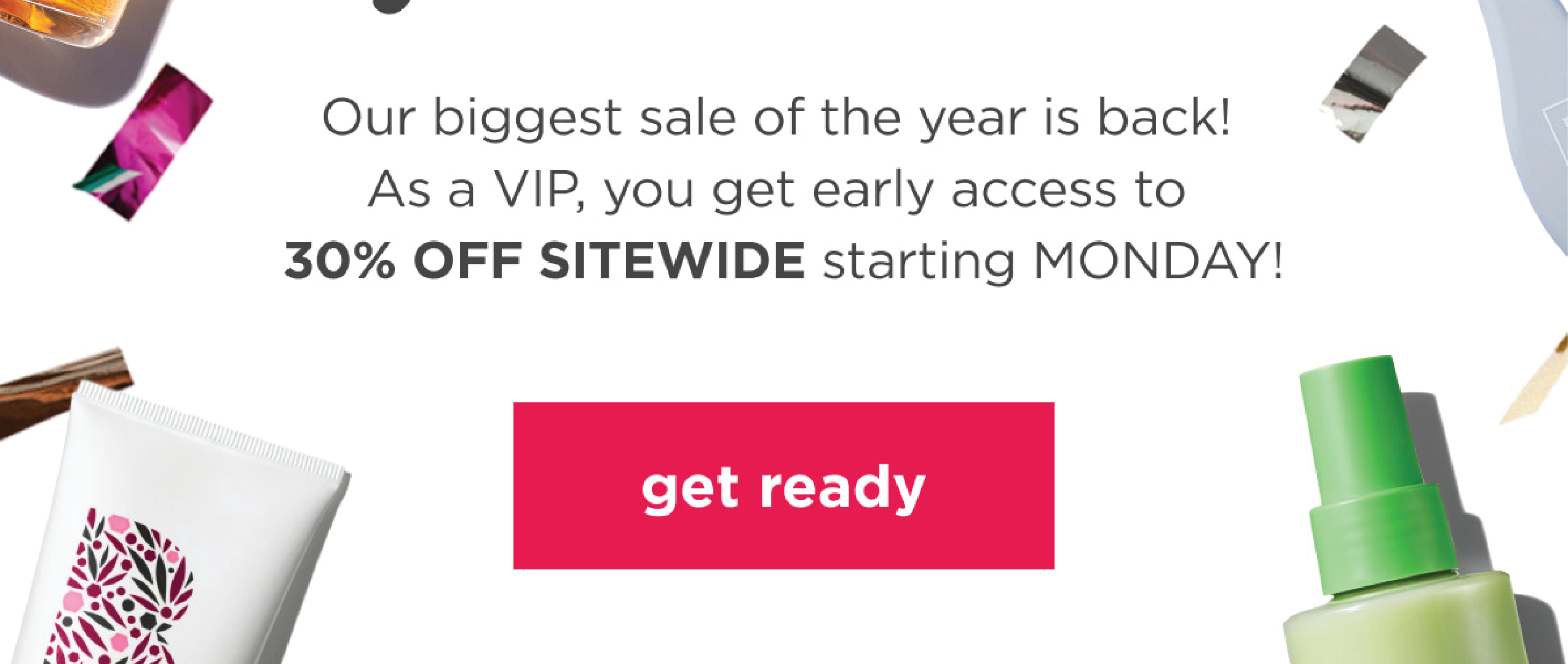
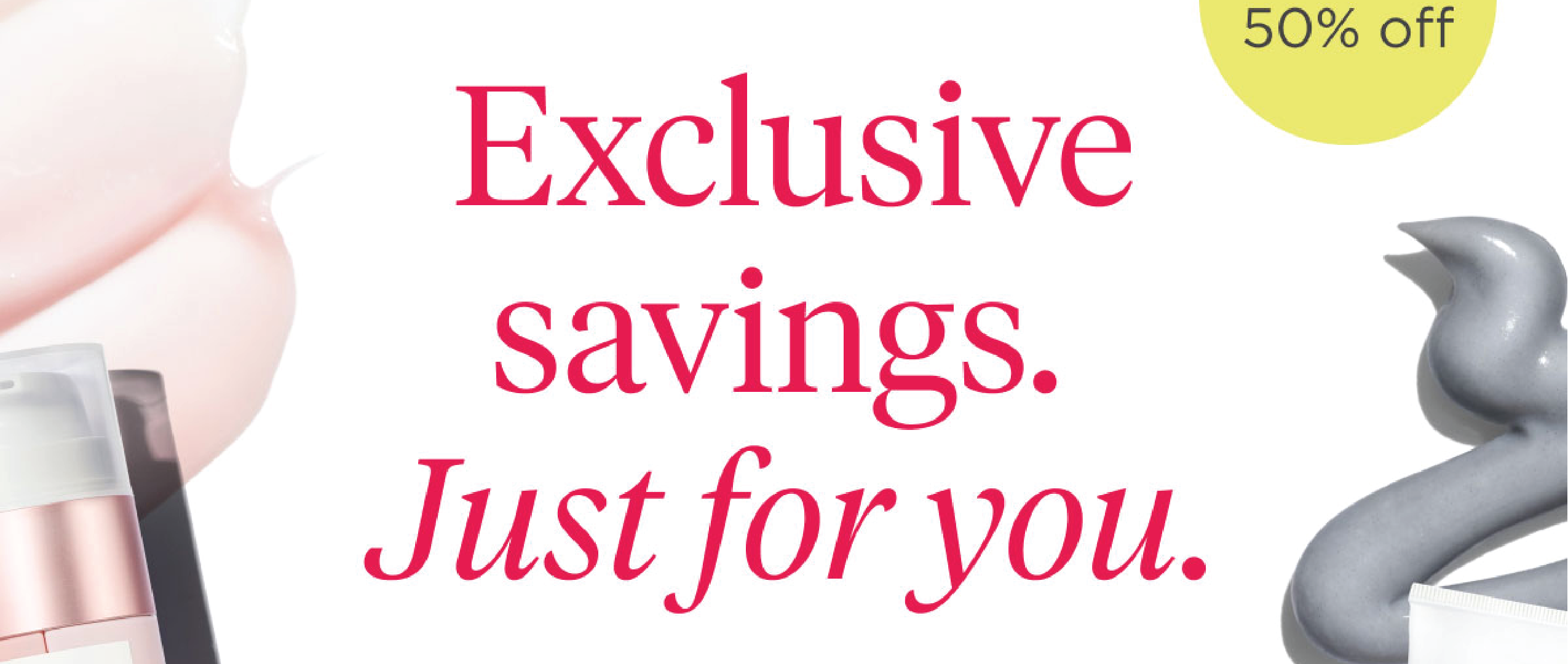
1. Start with a Bold, Clear Headline
Your headline should be the first thing readers see. It needs to stand out, grab attention, and make them want to keep reading.
Action Step: Use a larger font, bold type, or a unique style to make the headline pop. Keep it short and benefit-focused, so readers instantly know why they’re there.

2. Use Subheadings and White Space
Subheadings help break up content, and white space gives the reader’s eye a place to rest. Together, they make the email easier to scan and read.
Action Step: Add clear subheadings for each section, and leave space around them. Don’t crowd the email with text. Let it breathe, so readers don’t feel overwhelmed.
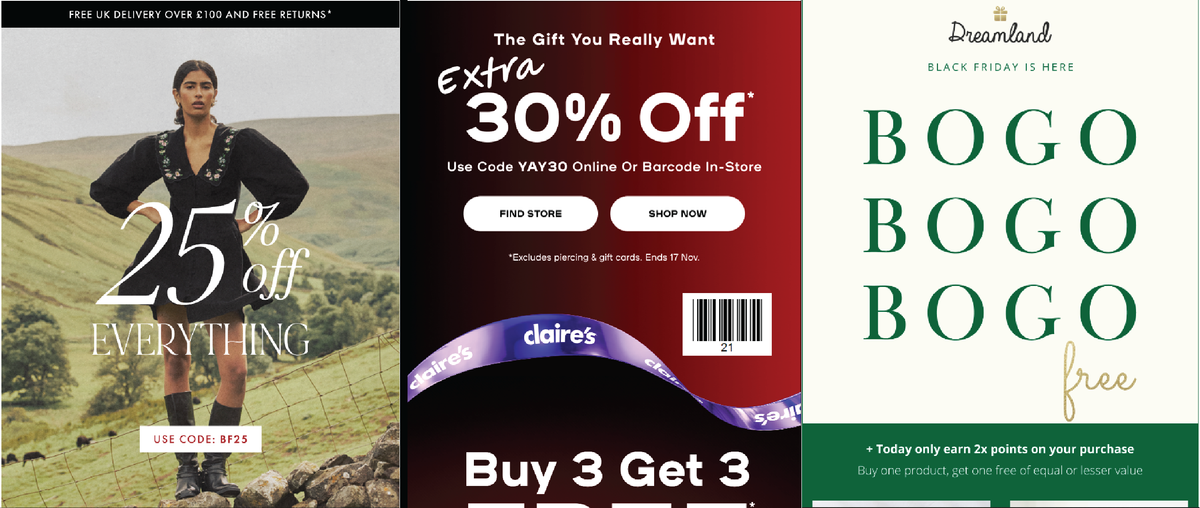
3. Highlight Key Points with Size and Color
Readers are drawn to larger, bolder elements. By making important details like CTAs or offers stand out, you give readers a clear path to follow.
Action Step: Use a larger font or bold color for your CTA, like “Shop Now” or “Get Discount.” This draws attention and makes it obvious where to click. If you can, use a brand-friendly accent color to make the CTA stand out.
4. Guide the Eye with Contrast and Alignment
High contrast (like dark text on a light background) makes emails easy to read. Alignment keeps everything looking clean and helps readers flow from one section to the next.
Action Step: Use contrasting colors for headers, text, and buttons to create separation. Keep everything aligned, so readers can scan the content smoothly.
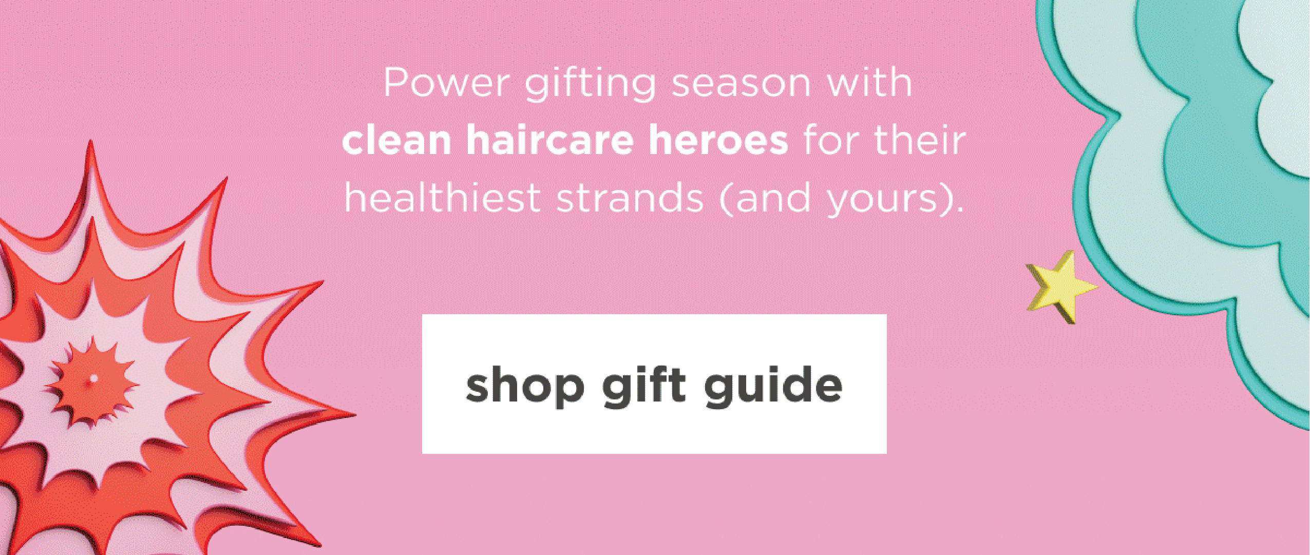
5. Use Visual Cues to Direct Attention
Icons, arrows, or small images act like signposts. They nudge readers to key parts of the email without overloading the design.
Action Step: Place small cues near important info or buttons. An arrow toward a CTA or a small icon beside an offer works well to guide the eye.
6. Keep Content in Small, Digestible Blocks
Long text blocks overwhelm readers. By breaking content into smaller chunks, you make it easy to absorb and follow.
Action Step: Use bullet points, short paragraphs, and lists to simplify information. Each block should feel like a step, guiding readers toward the next part and, ultimately, to the CTA.

7. Make CTAs Unmissable
The CTA is where action happens, so make it the star. The study showed that a strong CTA drives higher clicks because it’s clear and inviting.
Action Step: Make your CTA button large, clear, and surrounded by white space. Use strong, action-focused text like “Buy Now,” “Shop Today,” or “Claim Offer” to motivate clicks.
Conclusion
Visual hierarchy isn’t just about pretty design; it’s about getting results. When you guide readers through your email with clear structure, you make it easy for them to engage and act. A bold headline, clean sections, strong CTA, and subtle cues create a flow that keeps readers focused and drives clicks.
Try these techniques in your next campaign. Small changes in layout and structure can make a big difference. In email marketing, every detail counts. Make them count for your brand.